
Overview:
- Contributed to the PayTile Design System.
- Designed and delivered new components based on the business requirements, document design patterns, icons, illustrations, animations for desktop and mobile devices.
- Role: UX designer in the Design System team
- Responsible for UX design within the Design System team, ensuring consistency and usability across all components.
person
User Research
Created user personas and conduct user interviews to understand the user needs, behaviors, and preferences through research, like surveys.
create
Wireframing and Architecture Design
Designed low-fidelity wireframes to visualize interface layout and structure.
palette
Visual Design
Created high-fidelity mocks from color schemes, typography, and visual elements for the brand and aesthetically pleasing interface.
gesture
Prototyping and Usability Testing
Designed interactive prototypes and conduct usability testing to evaluate the user experience. Receive feedback and make refinements.
searchResearch
As part of the UX team, I worked closely with the Design System lead to creating elements like colors, spacing, typography, elevation, and shadow. We worked on the components: buttons variant and states, data display visuals, visual feedback, navigation, etc. I also created system and outline icons and mid and high-level illustrations using our brand colors.
palette Color Palette
#B760ED
Purple
#6E3AA0
Deep Purple
#FFBD35
Yellow
#F9F3FD
Light Purple
Wireframes
Brainstorming and sketching wireframes for the project.
Illustrations
Creating mid and high level web and mobile illustrations.
Spacing and Redlining
Maintaining consistent spacing and redlining for UI elements.
Spacing and Redlining
Ensuring precise spacing for UI components.
format_paintDesign & Components
Text fields variants, types and states
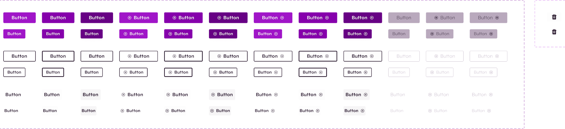
Buttons
We have defined clear guidelines for button variants, sizes, colors, and behavior to create a cohesive user experience.
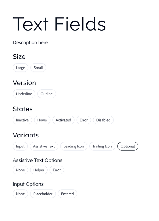
Text Fields
Our design system provides a consistent and intuitive approach to designing text fields, ensuring a seamless user experience across the product.
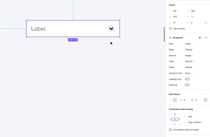
Dropdown Component
Components have been crafted with a focus on usability, consistency, and visual appeal, ensuring a cohesive and intuitive user experience.
movie_creation
Prototype & Animations
Created rich animations for visual treatments
Peer-2-Peer Transactions with people
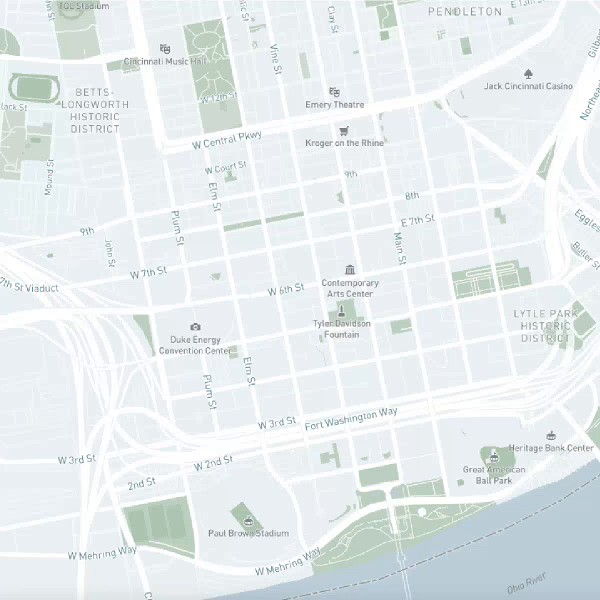
Offering users a seamless and secure peer-to-peer transaction experience. Leveraging advanced mapping technology, users can effortlessly locate nearby individuals to send funds securely, all while prioritizing privacy. Sending money can become not just efficient, but also discreet, empowering users with complete control over their payment interactions.
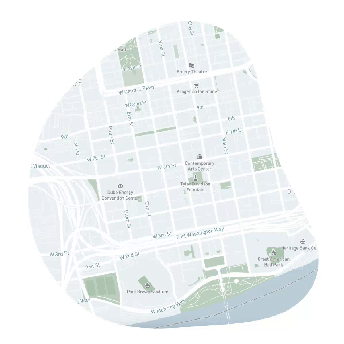
Dropping money on the map
Enable users to collect money or incentives dropped on the map by friends, family, or businesses with pinpoint accuracy. This fosters community engagement and empowerment, making the experience convenient and rewarding.
trending_upEvaluation
How we got here
The evaluation phase reflects on the journey taken thus far in the project. It involves assessing the progress made, challenges encountered, and the overall effectiveness of the design decisions and implementations.
Findings and Ideation
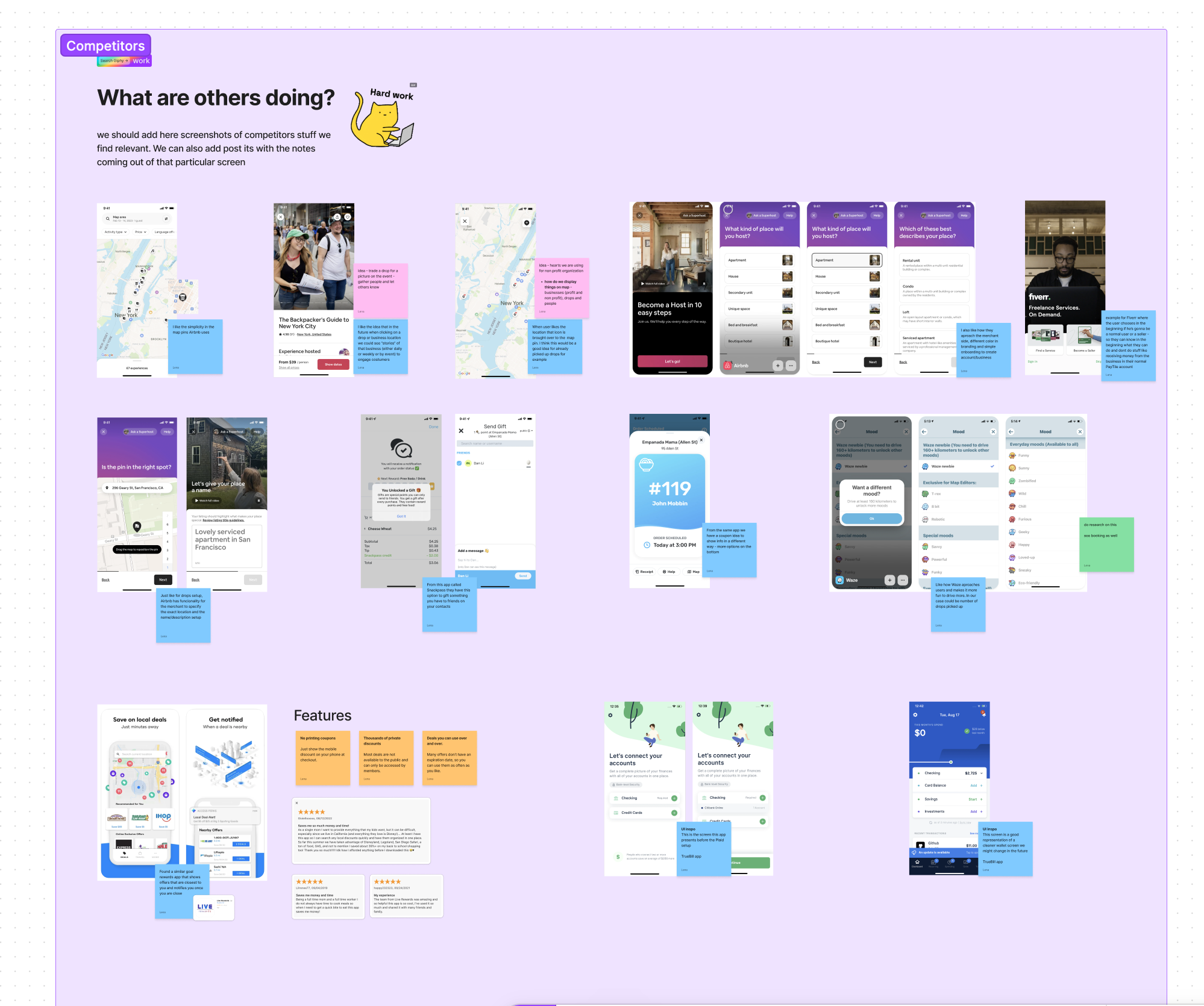
In our competitor analysis using FigJam or Figma, we're focused on how others are visually representing their research findings, collaborating on design concepts, and iterating on ideas in real-time. We're keen to understand how competitors are utilizing these tools for efficient brainstorming, wireframing, and prototyping, ultimately to inform our own design and research strategies.
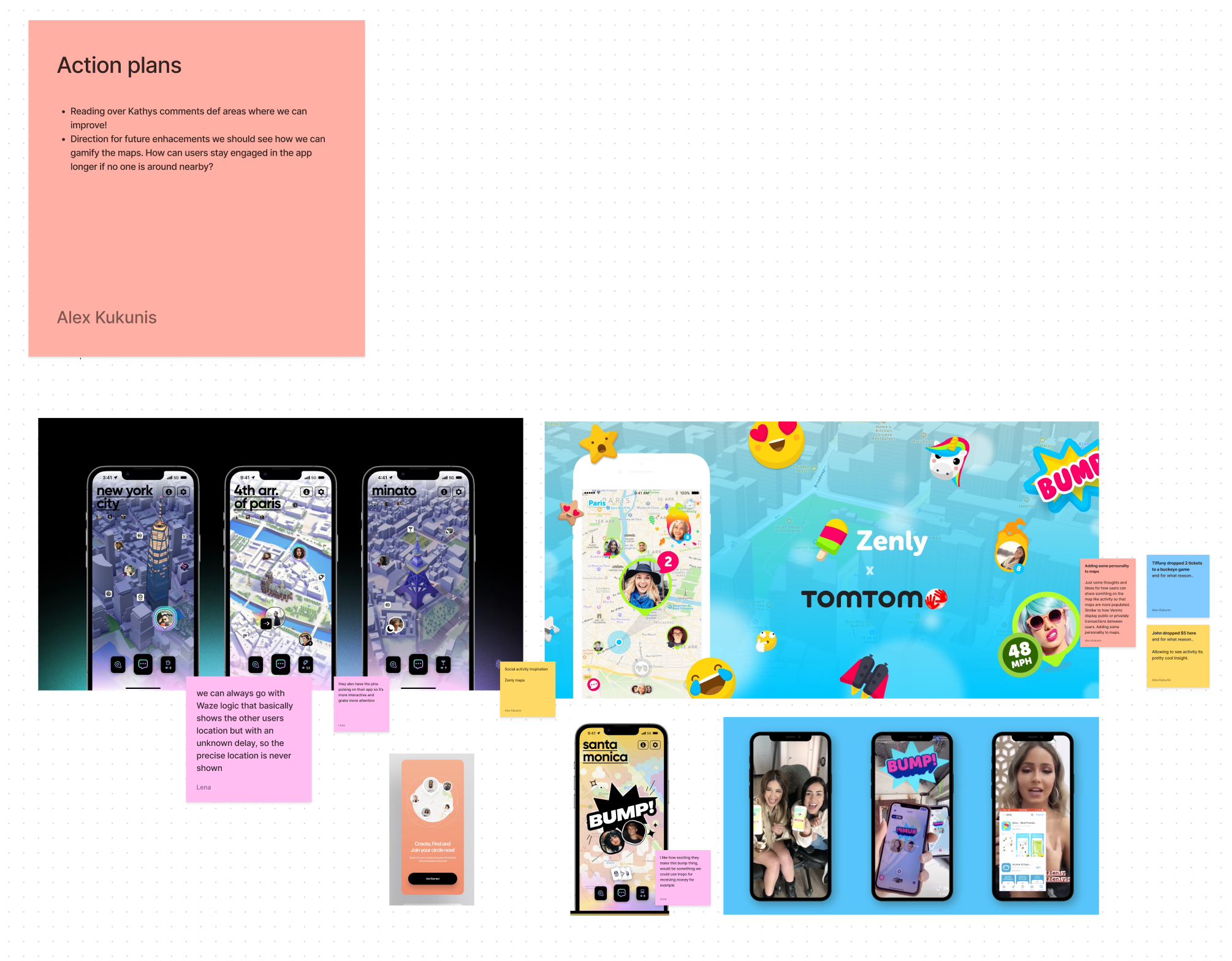
User engagement
Analyzing market design experiences, we identify improvement areas for longer user engagement. We'll enhance user flows, UI/UX, and introduce innovative features to keep users captivated and satisfied, ensuring prolonged app interaction.
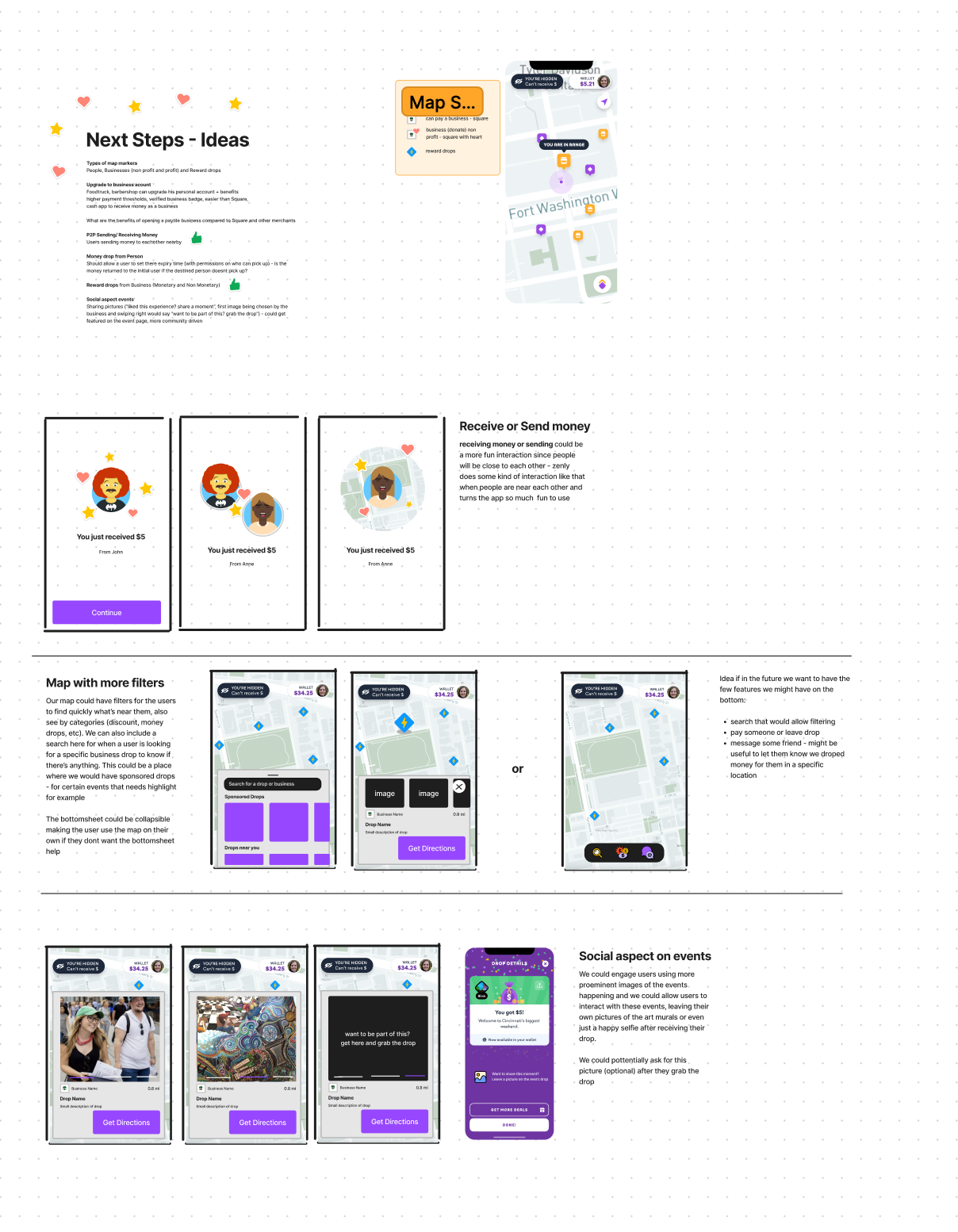
Features and Capabilities
In ideating map features, we're focusing on seamless user interaction for payments. Our goal: effortless transactions and enhanced community engagement.
Captivating Illustrations
Visual aids and illustrations are integral to our branding, enriching the user experience with engaging visuals that resonate with our brand identity. From vibrant graphics to cohesive design elements, we strive to convey our brand message effectively and captivate our audience across all touchpoints.
Brand focus
Through compelling visuals, we aim to create a memorable and cohesive brand experience that resonates with our users.